Grabbing
Primary Designer: Choong Zhan Hong
Overview
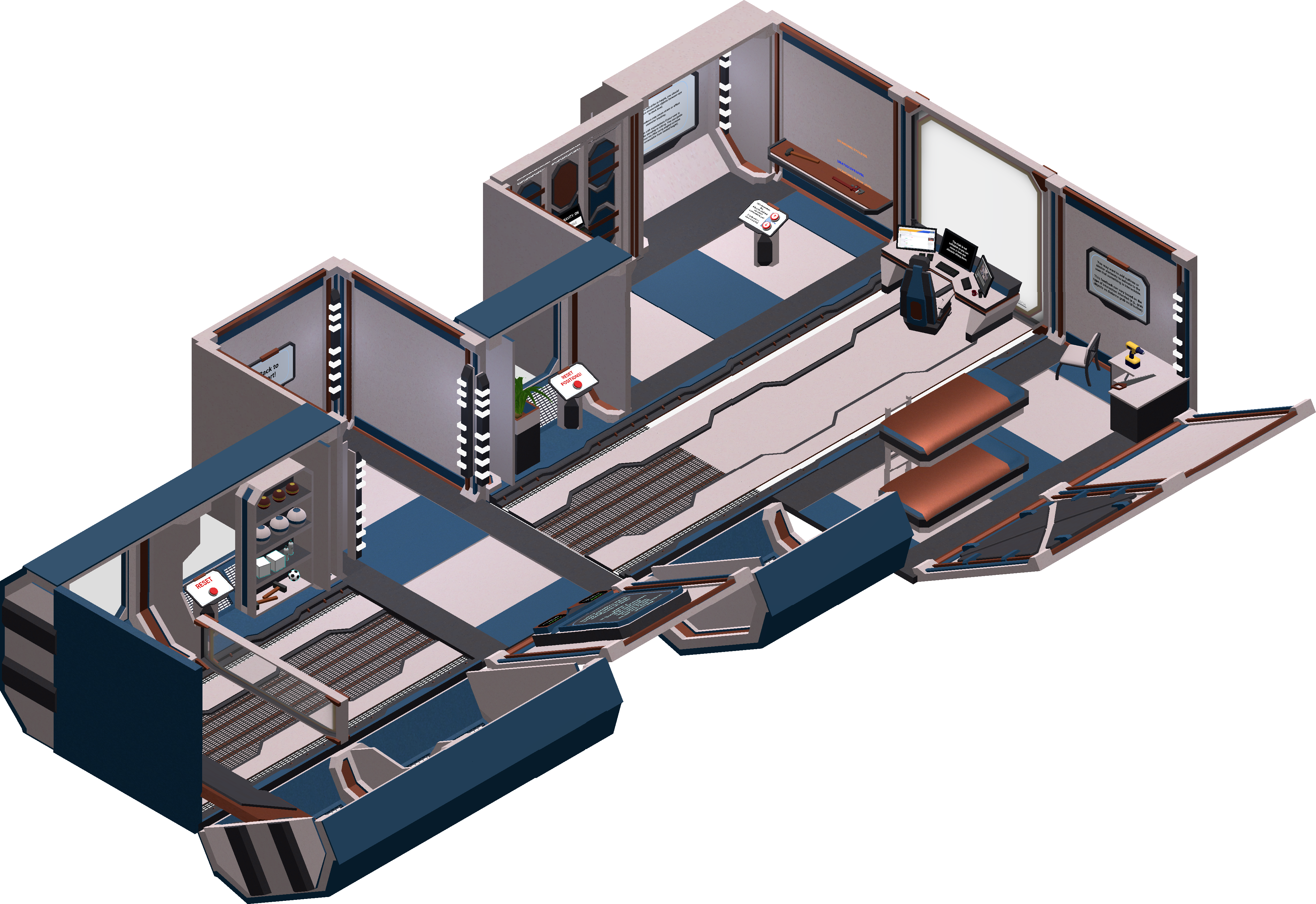
The Grabbing Room is meant to embody the concepts around designing for user interaction in VR. The most common interaction would often be grabbing of objects, hence the importance of understanding design principles around grabbing and interaction with objects.

Contents
Designing for Height
VR users can use programmes sitting or standing, and VR affords a wide range of movement, but it is still important to make the movement comfortable. It is thus good to constrain design to the user’s own physical constraints, or even the VR headset’s technical constraints (such as keeping within tracking range of some VR sets).
Height of Interactables
To summarise the best practices found online (See References), the following are some guidelines to follow:
- Keep interactable objects between desk (1m) to eye-level height.
- Eye-level and above elements are generally for viewing only, with interactions near desk or elbow level.
- Design for standing or sitting users. You can decide beforehand if your user should be standing or sitting.
- You can guide user’s behaviour through built-in constraints. Example: angled screens that can be viewed while standing but not while sitting.
This room features shelves, tables, and interactable elements designed to let the user experience different height levels intuitively.
Affordances for Interaction
It is important to distinguish interactable objects from environmental or cosmetic elements. In scenarios such as games, this gives the user an intuitive grasp of what actions they can take. Your program should thus indicate to the user what are the affordances of the objects around them.
Outlines
A very simple way to indicate such affordances is through outlining your objects to make them stand out. In my scene, I made use of a free and super comprehensive asset that comes with a variety of outline styles.
To name a few, you can outline objects if they’re visible/hidden, or even show a silhouette when it’s behind a wall. So, there’s many ways to provide outlines in different scenarios. Imagine: you would want less visible outlines in a puzzle game (to not make things too obvious) or to make your scene more immersive/less visually cluttered.
Varied Affordances
Apart from interactions with 3D objects, the user can sometimes interact with UI as well. Our entire project allows users to interact with UI using a laser pointer as an indicator. This scene helps to point out the fact that we can differentiate UI from 3D game objects using different indicators.
3D Objects
This level also contains 3D buttons that are directly interacted through contact with the hand controllers. So, the user gets a full overview of the different types of interactable elements and how these feel for the user, when interacted with.
The different types of interactables are also suited to different uses. The red buttons might be suited for infrequent pressing as it is hard to press multiple times, or to enable easily holding down the button. So, our red buttons are used to reset objects or to operate the moving shelf, which maps quite well to real-world buttons.
Crosshairs and Others
When designing multiple interactions, you may require different indicators. As an example, you may want to indicate something is grabbable and another thing is interactable (like an object vs a lever). Or, something is grabbable from a distance and another is only grabbable physically. Aside from outlines, you can also use things like crosshairs or changing colour of objects to make them stand out!